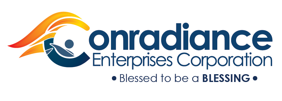
Evolution of Conradiance Enterprises Corporation Logo
Big companies like Pepsi, Apple, Microsoft and Google to name a few, change their logo to show innovation and growth. A logo reflects the company’s character, its services, mission, and goals as well.
Conradiance Enterprises Corporation is one of the Top distributor of Unilever Philippines, particularly in Bulacan. The company provides services in food, home and personal care, etc.
The said company has taken its first step of innovation by updating their logo. From the traditional circular logo, rsvprojects helped conceptualize a modern version.
Conradiance’s Former Logo
The former logo illustrates men and women hand in hand represent the unity of the company and its constituents. The rays of light and flame/torch signifies the bright mission they have for its customers. As years passed, the logo embodied the company’s excellence in the industry.

Conradiance Enhance and Proposed Version
We had created and proposed modern design for the company that illustrates the mission and vision of the company.
It is imperative that the logo show the following:
- Christ Centered
- Excellence
- Being a Blessing
- Unity

The New Conradiance Enterprises Logo
The logo that had been chosen is the proposed version because of its modern design as well as it reflects the company’s mission and vision.


Innovation and Excellence is very important to our success in our business. Lets Conquer all the challenges in life. Congratulation Conradiance Enterprises Corporation and Thank you for giving us the chance to work with you!


